← All essays·July 31, 2026·5 min read
The data-platform scorecard
You built the stack and a practitioner owns it. Now, how do you know it is working? Most dashboards answer with query volume, which is a vanity metric. This is the scorecard that actually matters: adoption and reach, retention as the real adoption signal, the gold-layer query ratio as the trust metric to put on the wall, and decisions changed as the North Star. Measure the platform like a product and a trust asset, not a log file.
Listen to this page
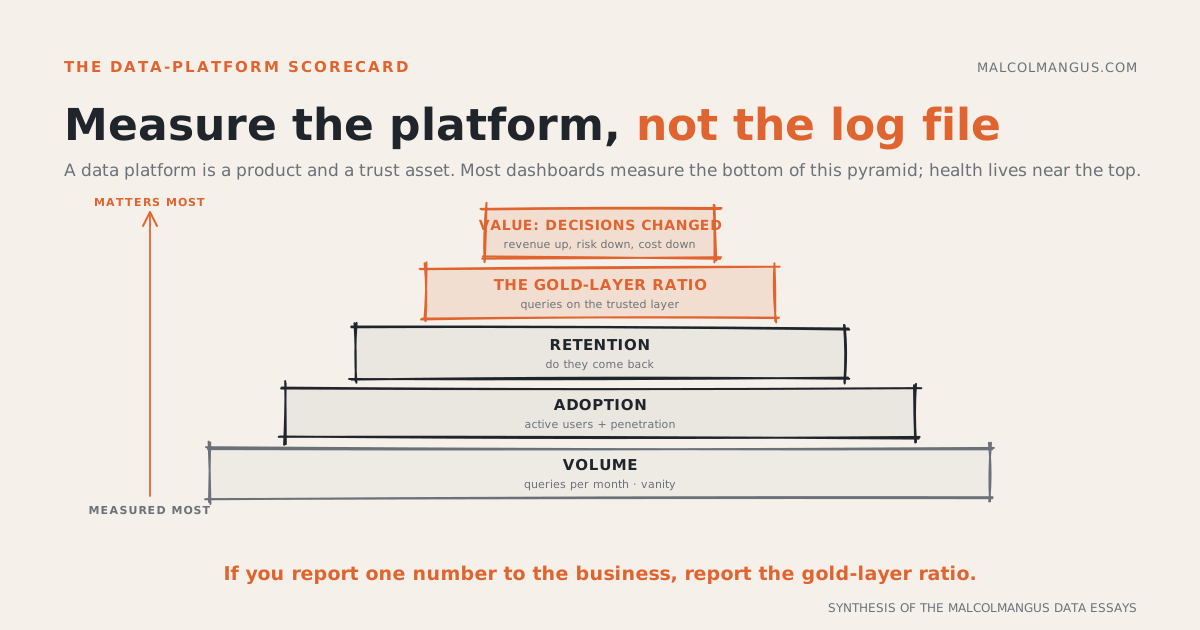
You built the non-negotiable stack, and a practitioner owns it. Now the question every leader eventually asks: is it working? The default answer is a number that looks like progress and means almost nothing.
Most data platforms report query volume. N queries this month, up and to the right. It is the easiest number to pull and the least informative one to have. A platform is an internal product and a trust asset, and you measure a product by whether people adopt it, come back to it, and trust it enough to bet a decision on it. Volume tells you none of that.
Here is the scorecard that does.
Volume is the vanity floor
Queries per month is context, not a scorecard. It goes up when you onboard one power user who automates a dashboard refresh, and it goes up when the whole company quietly stops trusting the numbers and re-runs everything three times. Same graph, opposite meaning. Keep it for capacity planning and trend, and never put it on the wall as a health metric.
Put simply: Query volume moves for good and bad reasons alike. It is a denominator, not a headline.
Adoption is reach, not a power-user cluster
The first real metric is reach: internal monthly active users, and, more telling, penetration. What share of departments has at least one active user, and what share of headcount actually logs in. A platform used deeply by three analysts and ignored by everyone else is a script, not a platform. Penetration tells you whether the thing became infrastructure or stayed a side project.
Put simply: Count active users, and more importantly how far across the org they reach. Breadth is the signal that it became infrastructure.
Retention is the real adoption signal
Adoption without retention is churn with onboarding. New-user signups are easy to manufacture and easy to celebrate; the number that matters is whether they come back. Track returning users and cohort retention: of the people who tried it this quarter, how many are still active two months later.
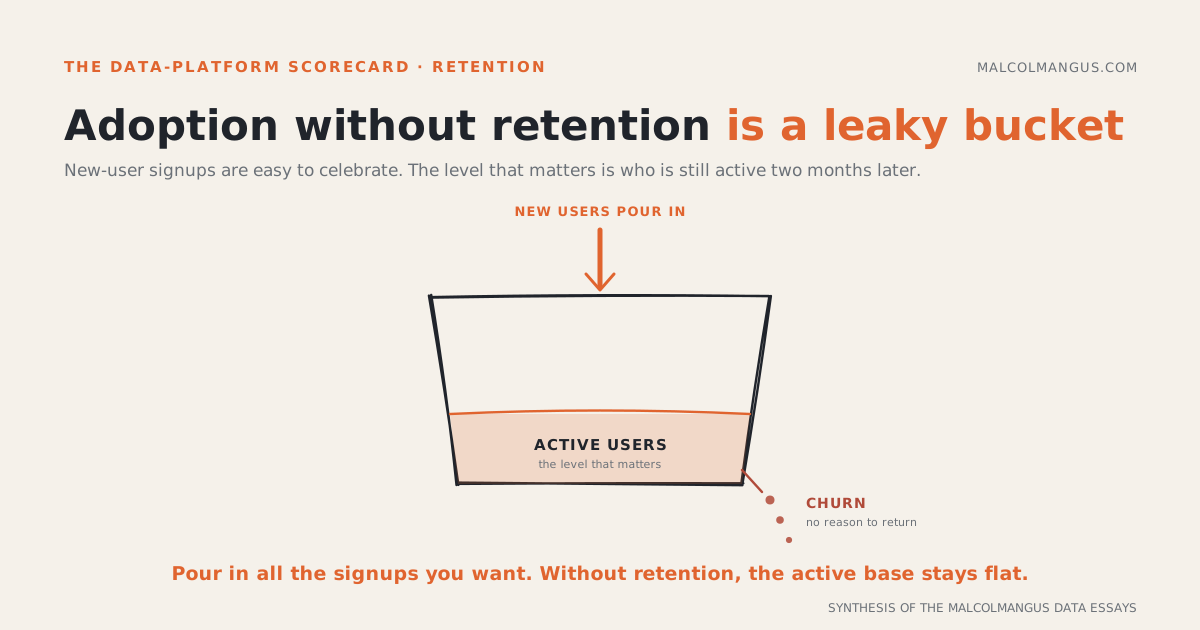
A platform people use once and abandon is failing, no matter how good the signup chart looks. The leaky bucket is the picture: the inflow is easy, the level is the truth.
Put simply: Measure who comes back, not who showed up. New users without retention is a leaky bucket.
The metric to put on the wall: the gold-layer ratio
Here is the one almost nobody reports, and the one that tells you the most: what share of queries hit the trusted, modeled layer, versus raw and staging tables.
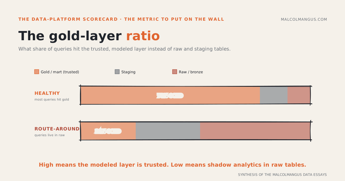
Every warehouse has layers: raw and staging at the bottom, and the curated, tested, semantically defined marts at the top, the gold layer. That gold layer is the whole point of the readiness stack: one definition, tested, owned. So the fraction of real query traffic that hits gold instead of raw is a direct read on whether people trust it. When the ratio is high, the modeled layer is doing its job and correctness is centralized. When it is low, people are routing around governance into raw tables, re-deriving metrics by hand, and quietly rebuilding the shadow analytics the platform was supposed to kill. A low gold ratio is an early warning that readiness is decaying, long before anyone files a "the numbers are wrong" ticket.
Put simply: The share of queries on the trusted gold layer, not raw tables, is the best single read on whether your platform is trusted. Put it on the wall.
Value is the North Star
All of it rolls up to one question, the same one that governs any AI initiative: did it move revenue, risk, or cost. Adoption, retention, and the gold ratio are leading indicators; a decision that changed because of the platform is the outcome. It is the hardest to measure and the only one that ultimately justifies the bill. Instrument it anyway: tie a shipped decision back to the query that informed it, even if you can only manage it for the handful that matter most.
Put simply: Every leading metric points at one lagging one, a decision that changed. Measure the leading metrics weekly and the value quarterly, and never confuse the two.
What it adds up to
Most data-platform dashboards measure the bottom of the pyramid because it is easy, then leadership cannot tell whether the investment paid off. Climb it. Reach, then retention, then the gold-layer ratio, then value. If you report one number to the business, report the gold ratio, because it is the leading indicator that the readiness work is being trusted and used. Trust is the whole game.
Put simply: Measure the platform like a product and a trust asset. Volume is vanity, retention and the gold-layer ratio are the leading signals, and a changed decision is the point.

Malcolm Angus
I'm an analytics engineer, data product manager, and forward-deployed engineer. I write about data products, moats, flywheels, and business strategy, the loops that make companies harder to catch.

The charts in this essay are free to reuse with credit.