← All essays·July 8, 2026·11 min read
Revenue is wide, profit is tall
U-Haul rents trucks near cost and banks the margin on boxes. Carmaking earns scraps while car lending prints. A field guide to profit pools: mapping where an industry's money settles across the value chain, and why the revenue map misleads.
Listen to this page
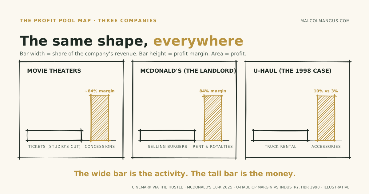
In the mid 1990s, U-Haul was winning the truck rental industry with older trucks, higher maintenance bills, and lower prices. Its operating margin ran about 10% while the industry averaged under 3%. Ryder, with newer trucks and cleaner economics on paper, gave up and exited consumer rentals in 1996.
The trick was that U-Haul had stopped thinking of itself as a truck rental company. Renting the truck cheaply was the way to put you in the store, and the store sold boxes, tape, insurance, trailer hitches, and a month of storage, at margins the truck could never earn. U-Haul's rivals priced to win the industry's revenue. U-Haul priced to own the industry's profit.
Two maps of the same industry
Every industry has two maps. The revenue map shows where the activity is: who sells the most, who employs the most, whose logo you see. The profit map shows where the money settles. They are almost never the same map, and nearly everyone runs strategy off the wrong one.
The profit map has a name: the profit pool. Two Bain partners, Orit Gadiesh and James Gilbert, coined it in a pair of 1998 Harvard Business Review articles, "Profit Pools: A Fresh Look at Strategy" and its how-to companion. The definition is strict and useful: a profit pool is the total profit earned in an industry at every point along its value chain. Not one company's margins. The whole industry's profit, mapped activity by activity, so you can see which stages hold the money and which just hold the work. U-Haul was their case study for a reason: the truck rental industry's revenue pool sat in trucks, its profit pool sat in accessories, and only one competitor had drawn the second map.
Put simply: A revenue map shows where money changes hands; a profit map shows who keeps it. They almost never match, and every strategy decision should start from the second map.
The original map: US autos
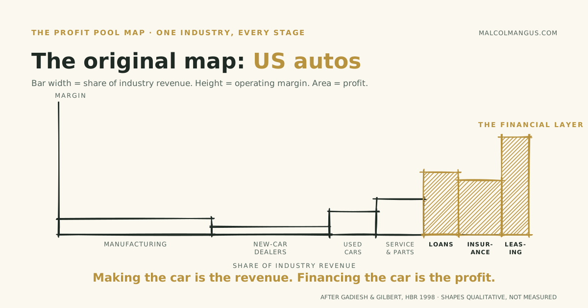
Their headline exhibit was the US auto industry, roughly a trillion dollars of revenue producing about $44 billion of profit. Making and selling cars generated most of the revenue and a weak share of the profit. The deep water sat downstream, in leasing, lending, and insurance, the unglamorous activities attached to the car after it rolls off the lot. Auto leasing was the single most profitable activity in the chain; manufacturing, the industry's public face, was among the weakest.
That map has aged well. In 2024, GM Financial, the lending arm, earned $1.9 billion per its own results release, against GM's $6.0 billion of total net income. Ford Credit reported about $1.7 billion before taxes in Ford's annual filing. A century in, a meaningful slice of Detroit's profit still comes from being a bank that happens to know a lot about cars.
Put simply: Making and selling cars is a huge business with thin profits; financing those cars is a smaller business with fat ones. The money is rarely where the activity is, so find the quiet layer that banks the spread.
Reading other industries
PCs, the Wintel era. For two decades the PC value chain did the same thing in silicon. Assembly and retail carried most of the industry's revenue at low single digit margins, while two component layers, Intel's chips and Microsoft's operating system, took 50%+ margins on their narrower slice. Dell and HP fought a knife fight over the wide flat bar; the tall bars cashed the checks. I walked through this one in Rookie vs. Pro.
Smartphones. Sometimes the pool concentrates within a single layer instead of across layers. In 2022, Apple shipped about 18% of the world's smartphones and captured about 85% of the industry's operating profit, per Counterpoint; back in 2017 Strategy Analytics measured 83% of profit on under 15% of units. Market share charts are revenue map thinking. Share of units is not share of profit.
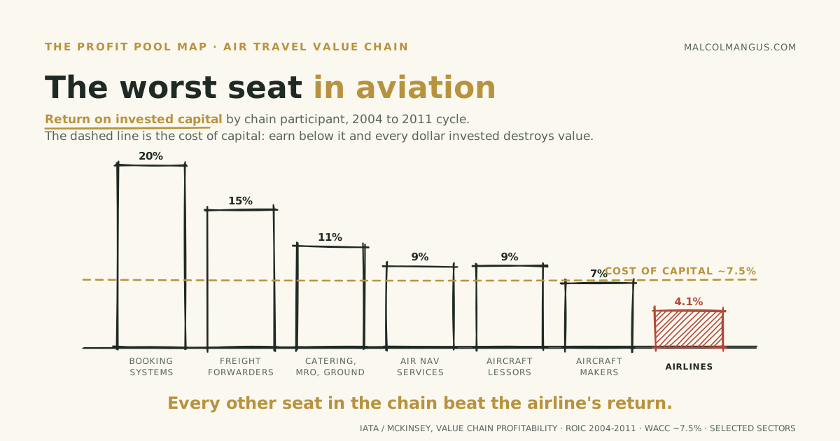
Air travel. The most complete pool map ever drawn may be IATA's, built with McKinsey across two decades of studies. The finding is brutal: airlines, the industry's public face, earned a 4.1% return on invested capital across the 2004 to 2011 cycle against a 7.5% cost of capital. That gap is what destroying capital means: the money tied up in planes was raised from lenders and shareholders who required roughly 7.5% to part with it, and flying returned 4.1%, so every dollar invested came back worth less than it cost to attract. The investors would have done better almost anywhere else in the chain, and IATA said so in its own words: "every supply sector and every distribution sector earned a higher return on capital." The reservation systems airlines book through earned 20% returns, double their cost of capital. Freight forwarders earned 15%. Even catering beat the carriers. The 2022 update found the whole chain underwater except two segments: fuel producers and freight forwarders. The most glamorous seat in the industry is the worst one at the table.
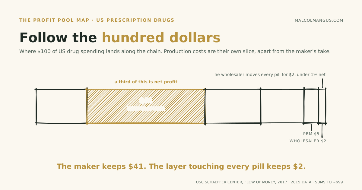
Pharmaceuticals. Follow a single dollar instead of the whole chain. Of $100 an American spends on drugs, per USC's Schaeffer Center: about $41 accrues to the manufacturer, a third of that as net profit, while the pharmacy keeps $15, insurers $19, the pharmacy benefit manager $5, and the wholesaler $2 with less than a 1% net margin. The chain's power story hides in the thin slices: three PBMs process nearly 80% of US prescription claims, earning modest margins on enormous, concentrated flow. Wide bars are not always weak, and thin slices are not always powerless, which is why you map dollars, not vibes.
Food delivery, the modern map. Run the exercise on a delivered dinner. The restaurant that cooked it earns thin margins: the median full service restaurant makes 2.8% before taxes, the median limited service one 4.0%, per National Restaurant Association operations data. The platform on top takes 15 to 30% of the order depending on tier, and McKinsey's delivery study concluded that commissions of that size against margins of that size are unsustainable as delivery grows.
So the platform owns the pool? For a decade, nobody did. DoorDash lost money every year from its founding until 2024, roughly $5.3 billion of accumulated losses at the peak, and its first profitable year cleared the bar on interest income while operations still ran negative, per its own filings. Competition and subsidies held the entire chain underwater: diner subsidized, restaurant squeezed, courier hustling, platform bleeding. Then the war ended and the survivor started collecting: $935 million of net income on $13.7 billion of revenue in 2025. And the deepest corner is the quietest one. DoorDash's advertising business crossed a $1 billion annualized run rate, selling visibility to the same restaurants that already pay commission. Some chains hold almost no pool at all until the fighting stops, and when the pool finally fills, it fills at the bottleneck: not cooking, not driving, but attention.
Put simply: Across PCs, air travel, drugs, and delivery, the companies doing the visible hard work earn thin margins while a quieter adjacent layer collects the profit. Map your own value chain before assuming your position in it is the good one.
Pools move
Here is what makes this strategy and not trivia: profit pools migrate.
Clayton Christensen called the mechanism the conservation of attractive profits. When a layer of the value chain commoditizes, the profit does not vanish. It slides to the adjacent layer that has become the new bottleneck. The PC pool moved from the box makers to Intel and Microsoft. The auto pool leaked from the assembly line to the finance desk. The delivery pool is seeping from logistics into advertising.
So the question is never just "where is the pool." It is "where is the pool going, and which layer is commoditizing right now."
Run that question on AI, the largest capital deployment of this decade. The revenue map shows model companies and a thousand apps. The profit map shows the bottom of the stack: Nvidia's data-center segment did $115 billion in fiscal 2025 at a 75% company gross margin, and by one industry tally Nvidia alone captured 63% of the top ten chipmakers' combined net profit in 2024, with TSMC and ASML holding the next pools behind their own bottlenecks, a 62% foundry share and a monopoly on EUV lithography machines. Meanwhile the flagship model builder reportedly ran a roughly $21 billion operating loss on about $13 billion of revenue in 2025, and analysts peg typical AI application gross margins around 50 to 60%, well below the 80-plus of classic software, because inference bills eat the difference. In a gold rush, the first pool forms under whoever sells the scarce input.
But pools move, and this one will. Chips are a bottleneck today; bottlenecks attract capacity, and capacity commoditizes. When the model layer gets cheap, the profit will slide to whatever layer is scarce next. My bet is that for most companies that layer is the proprietary context that makes a rented model useful, which is an argument I've made in full.
Put simply: Profit pools do not stay put: fat margins attract competition, thin out, and the profit slides to whatever is scarce next. Position for where the pool is going, not where it is.
The company-sized cousin
There is a related move that looks like a profit pool map but runs at a different altitude: a single company arranging its own products so that one is the crowd and another is the margin. Strategists file this under loss leaders and cross subsidies. It deserves its own essay, but three quick sketches show the shape.
Movie theaters. The studio takes the lion's share of the ticket, about 60% on average and commonly reported as up to 90% in the opening weeks. The theater's real business starts at the counter: Cinemark once reported roughly $1.1 billion of concession revenue against $181 million of cost, an 84% gross margin, and concessions run around a third of a big chain's revenue but roughly half its gross profit. The screen is the anchor tenant. The counter is the store.
McDonald's. Harry Sonneborn, the company's first president, told Wall Street investors the quiet part: "We are not basically in the food business. We are in the real estate business." The burgers, he said, were simply the best generator of revenue from which tenants could pay rent. The 2025 annual report still agrees: company-operated restaurants earn about 15% restaurant margins, franchised revenue runs at 84%, rent alone brings in $10.4 billion a year, more than royalties, and roughly 90% of restaurant margin dollars come from the franchised side. One asset manager pegs the property estate's market value near $120 billion. The product exists to feed the asset.
The checkout line. Printers sell near cost so the ink can be an annuity. Gyms price January against the statistical certainty of your absence in March. Concert tickets grow fees at checkout because the fees are the point.
And the strangest company-sized pool of all belongs to the airlines, whose frequent-flyer programs quietly became more valuable than the airlines themselves, a story about minting your own currency that got a full essay of its own.
Put simply: The same pattern lives inside single companies: theaters profit at the snack counter, McDonald's profits as a landlord. Know which part of your own business is the traffic driver and which part actually pays the bills.
How to read any industry in three questions
- Draw both maps. Where is the revenue, and where is the profit? Gadiesh and Gilbert's own recipe is four steps: define which activities count as the chain, size the total pool, slice it by activity, and reconcile so the slices sum to the whole. Measure profit in dollars, not market share. The practitioners' refinement: use economic profit, returns above the cost of capital, as the IATA studies do, and normalize over several years so one hot cycle does not redraw the map.
- Ask who is fighting and who is collecting. Brutal competition is the revenue map's signature; quiet, boring, recurring margin is the pool's. If a layer feels like a knife fight, the profit probably left it already.
- Ask what is commoditizing. That tells you where the pool goes next. Owning today's pool is a position; seeing tomorrow's is an edge.
One warning: access is not capture. Payments, insurance, and lending hold enormous pools behind licenses, capital requirements, and capabilities you may not have. A pool you cannot reach is scenery. But a pool nobody has noticed, sitting one activity away from the work you already do? That is the U-Haul move, and it is the one worth mapping.
Put simply: Where does the revenue flow, who keeps the profit, and what would make that change? Three questions, honestly answered, beat most strategy decks.

Malcolm Angus
I'm an analytics engineer, data product manager, and forward-deployed engineer. I write about data products, moats, flywheels, and business strategy, the loops that make companies harder to catch.

The charts in this essay are free to reuse with credit.